Univariate/Descriptive Statistics & Normality
What are Univariate/Descriptive Statistics?
There are various ways to call a number of univariate statistics in
R. As social scientists, the main univariate statistics we are concerned
with are the mean, median, standard deviation, minimum, maximum, and
range. R comes with a stock function, which, unfortunately, does not
provide some measures. Therefore, we use the describe function from the psych package (or the
univ.desc function from the vannstats
package). We can call univariate statistics for both the full data set
and a specific variable.
First, let’s load the packages as libraries
And create the data1 object out of the
Defendants2025 data.
Descriptive Statistics
For the full data set, we can call univariate statistics as such…
##              vars    n     mean       sd   median  trimmed      mad     min
## id              1 1738   869.50   501.86   869.50   869.50   644.19    1.00
## age             2 1738    35.39    11.36    34.00    34.74    11.86   17.00
## race*           3 1738     3.13     1.14     3.00     3.09     1.48    1.00
## race_binary*    4 1738     1.22     0.41     1.00     1.15     0.00    1.00
## charge*         5 1738     3.29     1.57     4.00     3.23     1.48    1.00
## gang*           6 1738     1.17     0.38     1.00     1.09     0.00    1.00
## priors          7 1738     1.63     1.32     1.00     1.50     1.48    0.00
## gun*            8 1738     1.42     0.49     1.00     1.40     0.00    1.00
## risk_score      9 1738     4.51     2.78     4.35     4.42     3.41    0.01
## bail           10 1738 22572.21 16200.18 20000.00 21764.73 18532.50 1000.00
## perkins*       11 1738     1.32     0.47     1.00     1.28     0.00    1.00
##                max    range skew kurtosis     se
## id            1738  1737.00 0.00    -1.20  12.04
## age             69    52.00 0.49    -0.36   0.27
## race*            5     4.00 0.48    -0.65   0.03
## race_binary*     2     1.00 1.35    -0.17   0.01
## charge*          6     5.00 0.02    -0.90   0.04
## gang*            2     1.00 1.71     0.92   0.01
## priors           6     6.00 0.74     0.34   0.03
## gun*             2     1.00 0.34    -1.89   0.01
## risk_score      10     9.99 0.20    -1.08   0.07
## bail         50000 49000.00 0.29    -1.14 388.59
## perkins*         2     1.00 0.76    -1.43   0.01
Whereas, for a specific variable, we can call univariate statistics as such…
##    vars    n mean   sd median trimmed  mad  min max range skew kurtosis   se
## X1    1 1738 4.51 2.78   4.35    4.42 3.41 0.01  10  9.99  0.2    -1.08 0.07
You could also call the same information using the
univ.desc function within the vannstats
package, as:
##      n     mean       sd variance median  min max  skewness  kurtosis
## 1 1738 4.506024 2.784066 7.751021   4.35 0.01  10 0.2015323 -1.076598
##           se
## 1 0.06678125
In addition, we can call univariate statistics for a variable but
broken out by groups/categories of another variable. Note, this is the
first step towards bivarate statistics (looking at the relationship
between two variables). We do this by using the describeBy function, where we
list the main variable first, and the grouping/category variable second…
as such…
##
##  Descriptive statistics by group
## group: asian
##    vars  n mean   sd median trimmed  mad  min  max range skew kurtosis  se
## X1    1 70 3.14 2.54   2.36    2.77 1.44 0.04 9.22  9.18 1.22      0.3 0.3
## -----------------------------------------------------------
## group: black
##    vars   n mean   sd median trimmed  mad  min max range skew kurtosis   se
## X1    1 435 4.82 2.82   4.74     4.8 3.53 0.02  10  9.98 0.03    -1.22 0.14
## -----------------------------------------------------------
## group: latine
##    vars   n mean   sd median trimmed  mad  min max range skew kurtosis  se
## X1    1 817 4.82 2.81   4.96     4.8 3.31 0.01  10  9.99 0.01    -1.11 0.1
## -----------------------------------------------------------
## group: other
##    vars  n mean   sd median trimmed  mad  min  max range skew kurtosis   se
## X1    1 34 3.69 2.64   3.44    3.45 2.71 0.01 9.98  9.97 0.68    -0.22 0.45
## -----------------------------------------------------------
## group: white
##    vars   n mean   sd median trimmed mad  min  max range skew kurtosis   se
## X1    1 382  3.8 2.53   3.42    3.58 2.7 0.03 9.98  9.95 0.61    -0.36 0.13
Similarly, you can use the univ.desc function to call
the same information (as describeBy) by adding your
grouping variable as an additional item, as:
##     race   n     mean       sd variance median  min   max    skewness
## 1  asian  70 3.139286 2.542763 6.465644  2.365 0.04  9.22 1.221610349
## 2  black 435 4.821770 2.818715 7.945151  4.740 0.02 10.00 0.034226079
## 3 latine 817 4.820012 2.809088 7.890977  4.960 0.01 10.00 0.009597444
## 4  other  34 3.691765 2.639655 6.967779  3.440 0.01  9.98 0.679724152
## 5  white 382 3.797853 2.526206 6.381717  3.420 0.03  9.98 0.607126209
##     kurtosis         se
## 1  0.3017411 0.30391833
## 2 -1.2242178 0.13514702
## 3 -1.1060331 0.09827756
## 4 -0.2222203 0.45269710
## 5 -0.3629455 0.12925194
Above, we can see that the mean risk score differs by the race of the defendant (e.g. black and latine individuals have, on average, higher risk scores).
Skewness and Kurtosis
Skewness is the measure of how close or far a distribution is from symmetry (the normal curve). While it summarizes clustering of scores along the X-axis, with regard to the position of the mode, median, and mean, skewness is also concerned with length/width of the tails of the distribution, relative to one another.
Skewness ranges from \(-\infty\) to \(\infty\). The sign indicates the type of skew, with \(-\) indicating negative skewness, \(+\) indicating positive skewness, and 0 indicating no skew… (AKA symmetry, AKA the normal curve). The cutoffs for skewness are as follows:
High: \(\geq |1|\)
Moderate: \(|1| \geq x \geq |.5|\)
Low: \(|.5| \geq x \geq |0|\)
Kurtosis is sometimes referred to as a measure of the peakedness of the distribution, and how different the distribution is from mesokurtic (e.g. middle kurtosis, or the normal curve). Statisticians have argued that kurtosis is, more appropriately, a measure of the height/thickness of the tails of the distribution.
Statisticians have developed a kurtosis measure that represents excess kurtosis beyond the normal curve (although typical kurtosis ranges from 1 to \(+ \infty\)). This excess kurtosis measure ranges from \(-2\) to \(+ \infty\). Using this metric, negative values represent platykurtic distributions and positive values indicate leptokurtic distributions. Distributions close to a kurtosis value of 0 are considered mesokurtic. We use cutoffs to indicate types of kurtosis, as follows…
Platykurtic: \(-2 \leq x \lt 0\); or \(x \lt 0\)
Mesokurtic: \(x \approx 0\)
Leptokurtic: \(+ \infty \geq x \gt 0\); or \(x \gt 0\)
Calling Specific Univariate Statistics
Beyond using the describe function, you can call
singular desired univariate statistics. Here, we’ll ask for a specific
univariate statistic, one at a time, for the risk_score variable.
Below, we’ve added the option for , na.rm=T (alternatively, , na.rm=TRUE), meaning that if
data or observations are missing/NA for the variables we’re working
with, we still want R to calculate the statistic for the non-missing
cases by removing those missing cases (NAs), select TRUE.
## [1] 4.506024## [1] 4.35## [1] 2.784066## [1] 0.01## [1] 10## [1] 0.01 10.00## [1] 9.99Standardized Scores (Z-Scores) and Interval Estimates around Means (CI)
Z-Score
Recall that Z-scores are standardized scores – how close or far an observation’s score is from the mean, in standard deviation units. These are relative scores because the standard deviation (as well as the mean) incorporates information from all other observations.
The calculation for Z-scores is:
\(Z = \frac{(X - \mu)}{\sigma}\)
But, the above calculation relies on population parameters \(\mu\), (the population mean) and \(\sigma\), (the population standard deviation), which we often do not have information on. Instead, the calculation, for each observation’s Z-score, is:
\(Z_{i} = \frac{(X_{i} - \bar{X})}{SD}\)
where…
- \(X_{i}\) is the raw score for a
given observation
- \(\bar{X}\) is the mean for all
observations
- \(SD\) is the standard deviation
for all observations
For example, if we wanted to calculate a Z-score for an individual who received a risk score of 5, relative to all other defendants in the Defendants2025 data set, we would use the formula:
\(Z_{Individual} = \frac{(5 - \bar{X}_{risk\_score})}{SD_{risk\_score}}\)
Luckily, I’ve created a Z-score calculation function, z.calc(), for calculating a
z-score for a value, given the mean and standard deviation for a
variable within a data frame (or a list of values).
- the
data frame(or avalues list) variable namefor the variable of interestraw score
as such…
## Raw Score      Mean   Z Score
## 5.0000000 4.5060242 0.1774297
This indicates that the risk score for the individual is .177 standard deviation units above the mean.
Confidence Intervals
Recall that Z-scores are standardized scores – how close or far an observation’s score is from the mean, in standard deviation units. These are relative scores because the standard deviation (as well as the mean) incorporates information from all other observations.
The calculation for confidence intervals is:
\(CI = \mu \pm Z {\sigma}\)
…or, more appropriately, the calculation for a given confidence interval, based on a given confidence level (CL) is:
\(CI_{CL} = \mu \pm Z_{CL}{\sigma}\)
where…
- \(CL\) represents the Confidence
Level you’re interested in using (e.g. 95%, 99%, 99.9%, etc.)
- \(Z_{CL}\) represents the Z-score
associated with that Confidence Level you’re using (e.g. 95%, 99%,
99.9%, etc.)
For example, for the 99.9% CI, we would have an associated Z-score (\(Z_{CL}\)) of \(Z_{99.9} = 3.29\), such that, the CI calculation would be:
\(CI_{99.9} = \mu \pm 3.29{\sigma}\)
However, because the above formula relies on \(\sigma\), which is an unknown population parameter – the standard deviation of a variable from the population. Our best guess of that standard deviation population parameter is the standard deviation statistic from our sample, or \(SD\), but our sample standard deviation is based on fewer cases than the the standard deviation from the population . As such, we need to adjust the size of \(SD\) based on our sample size, creating a new value we can plug in in place of \(\sigma\), which is called Standard Error of the Mean: \(SE = \frac{SD}{\sqrt N}\). Moreover, because we are relying on data from a sample, we also need to rely on sample statistics, rather than population parameters \(\bar{X}\) Thus, our new confidence interval calculation becomes:
\(CI_{CL} = \bar{X} \pm Z_{CL}{\frac{SD}{\sqrt N}}\)
or….
\(CI_{CL} = \bar{X} \pm Z_{CL}{SE}\)
Below, I’ve added a CI calculation function, ci.calc(), for calculating a
confidence interval, for a given variable within a data frame (or a list
of values), for a given confidence level.
- the
data frame(or avalues list) variable namefor the variable of interestconfidence level
as such…
##       Mean   CI lower   CI upper Std. Error
## 4.50602417 4.37513291 4.63691542 0.06678125
Above, we see the mean for the risk_score variable
(within the data1 data frame), the lower and upper bounds
for the 95 percent confidence level, and the standard error.
Beyond this, we could read in a values list or a variable within a
data frame using the dollar sign operator. However, when doing this, you
should specify when you’re reading in the confidence level. For example,
if we wanted to calculate the 99 percent confidence interval for the
age variable from the data1 data frame, then
you could also run it as such:
##       Mean   CI lower   CI upper Std. Error
## 35.3935558 34.6917239 36.0953877  0.2724503
Assessing Normality with Visualizations
Histograms
In addition, you can create a visual representation (plot) of
univariate data using a histogram. For quickly plotting the histogram of
one variable, and to overlay a normal curve on our histogram, we can use
the hst function from the
vannstats package.
The hst function for
plotting one variable (e.g. not broken out by categories of another
variable) takes two arguments:
- the
data set name variable namefor the variable of interest
as such…
However, as we begin to move into analyzing bivariate relationships, we may find it necessary to visualize histograms by breaking them out by levels or categories of different variables.
To plot the histogram for risk score broken out by race use the same
hst function, from the
vannstats package, and simply add a third (and even up to a
fourth argument):
- the
data set name variable namefor the variable of interest(first) grouping variable name(second) grouping variable name
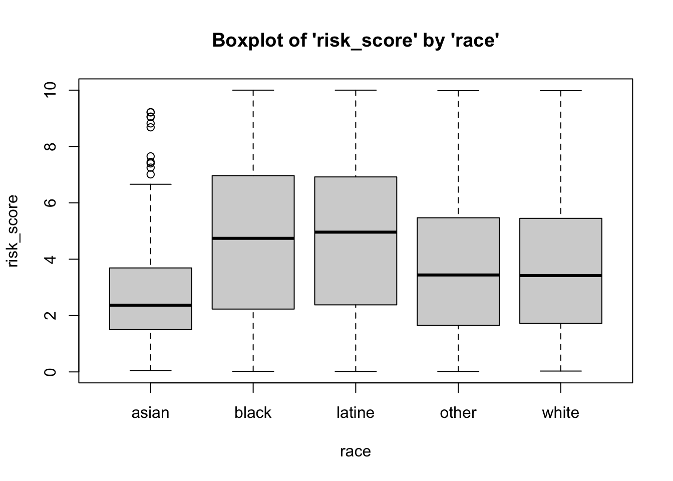
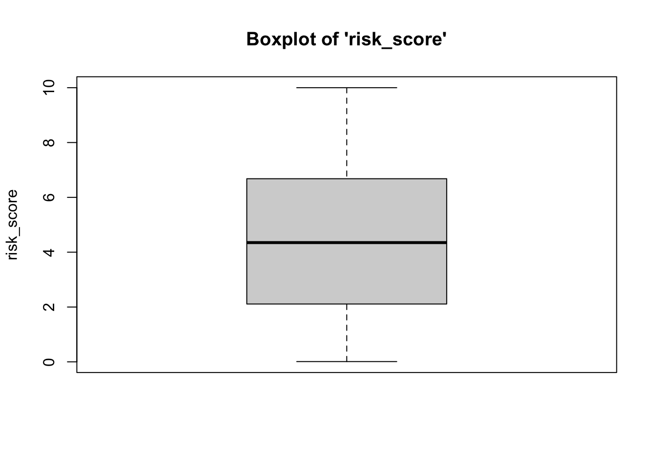
Boxplots (Box-and-Whisker Plots)
Boxplots also provide a visual representation of the normality of a distribution. The boxplot has a box, a line through the box, two whiskers on either end of the box, and sometimes dots/points outside the whiskers. Below, we get a sense of what each part of the boxplot represents…
- Bottom (or left end) whisker represents a point that is less than or equal to the calculation: 1.5x the size of the interquartile range (IQR). If there is an actual data point at that value, then the bottom whisker represents that point. However, if there is not an actual data point there, the bottom whisker is pulled inward to fall at the closest but less extreme data point.
- Bottom (or left end) of the box represents the first quartile (the 25th percentile case)
- Middle line (or dot) inside the box represents the median, also known as the second quartile (the 50th percentile case)
- Top (or right end) of the box represents the third quartile (the 75th percentile case)
- Top (or right end) whisker represents a point that
is less than or equal to than the calculation: 1.5x the size of
the interquartile range (IQR). If there is an actual data point at that
value, then the top whisker represents that point. However, if there is
not an actual data point there, the top whisker is pulled
inward to fall at the closest but less extreme data point.
of the whisker represents the maximum score for that
variable’s distribution, or, more appropriately, a distance above the
mean that is 1.5x the size of the interquartile range (IQR).
- Outside dots represent outliers - extreme high or extreme low values for that variable.
To determine whether or not a variable is normally-distributed using the box-and-whisker plot, generally, we want to see that there is some distance between the box and the end of the whiskers, that the box isn’t pushed too close to either whisker, that the median line (dot) is near the center of the box, and that there aren’t many outliers (dots) on the outside of the whiskers.
To plot a boxplot, we use the box function, from the
vannstats package. The function takes two arguments, if you
do not want to break it out by values of another variable:
- the
data set name variable namefor the variable of interest
Further, this function takes a maximum of four arguments:
- the
data set name variable namefor the variable of interest(first) grouping variable name(second) grouping variable name
To break the above boxplot out by categories of race, we can do the following…
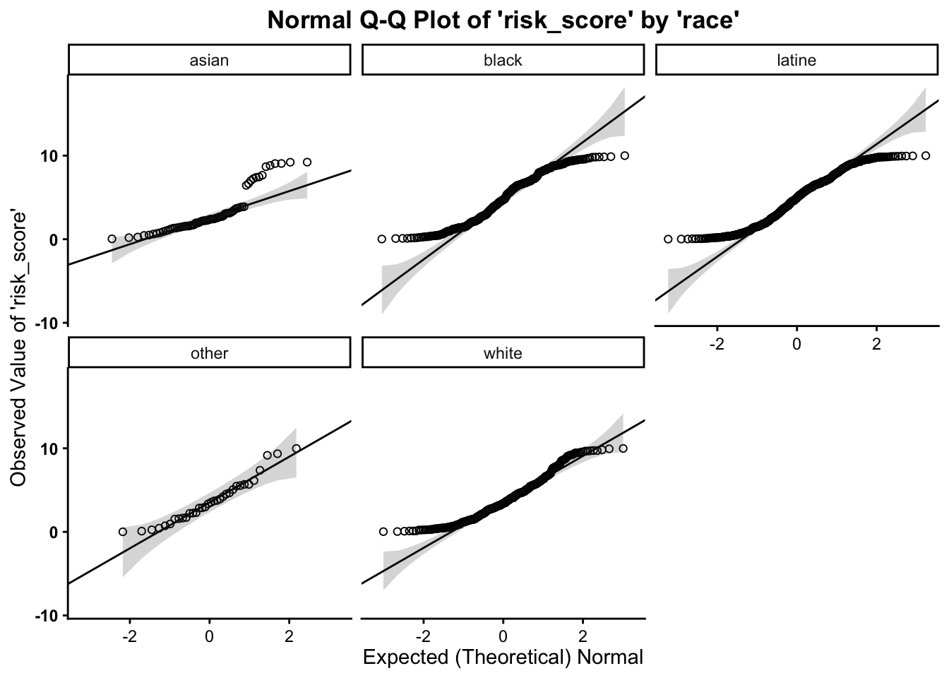
Normal Q-Q (Quantile-Quantile) Plots
Much as in the above, we want to assess whether or not our variable follows the normal distribution. As such, the quantile-quantile plot is a visual tool to help us figure out if the empirical distribution of our variable fits (or rather, comes from) a theoretical normal distribution.
We fit a plot of our data/variable (usually on the Y-axis) against ``theoretical data’’ that should occur if the data came from a normal distribution (e.g. Expected Normal on the X-axis). If our data actually fit a normal curve, then the dots on the plot should follow a straight line, or be reasonably close to the line plotted.
Below, we can assess normality to determine whether our variable
follows a normal distribution, using the qq function, from the
vannstats package. The function takes two arguments, if you
do not want to break it out by values of another variable:
- the
data set name variable namefor the variable of interest

This function also takes a maximum of four arguments:
- the
data set name variable namefor the variable of interest(first) grouping variable name(second) grouping variable name
As such, we can break this plot out by another grouping variable:

Working with Randomly Generated, Normally-Distributed Data
R also has a number of functions that work to generate random data.
To create random, normally-distributed data, use the rnorm function, which takes a
maximum of three arguments. It should look something like this rnorm(100,0,1), where the first
number (here, 100)
represents the number of cases or data points you want in your random
normally-distributed data. The second argument/number (here 0) is the mean that you want your
data to have. The third number/argument (here 1) is the standard deviation that
you want your data to have.
Note that the rnorm
function takes a maximum of three arguments – and it takes a minimum of
one argument (the number of cases/data points). The default settings for
the rnorm function is mean
of 0 and a standard deviation of 1. This means that rnorm(100) and rnorm(100,0,1) will output
similar means and standard deviations. Similar, not the exact same,
because these data are randomly generated, so the values of the
data points will vary a bunch but still have a mean of 0 and standard
deviation of 1.
Obviously, you can alter the number of cases involved.
##  [1]  1.36992879  0.02591930  0.38880477 -0.92775624  0.01587257 -2.96094647
##  [7]  0.23500522  1.50171961 -1.79285903 -0.45068622
or…
##   [1] -1.57846425 -0.74404657 -0.85902811 -0.13337447 -0.38862919 -0.35913332
##   [7] -0.47738362  0.36494865  1.59887768  1.15802972 -0.02891417 -0.45785551
##  [13]  0.73716864  1.09382498  0.94407055 -0.43384865  0.05013080  1.72241327
##  [19] -1.12236855  1.25766765  1.24273408 -2.00329707 -0.34467692  0.47008677
##  [25]  1.20637168 -0.47604056  0.56661312  0.26715286 -0.02669088 -1.31718734
##  [31] -0.47981563  0.90192906  0.13618648 -0.67122271  0.96229524 -0.89945691
##  [37]  0.52005428  0.58901465  1.57342507  1.25749476  1.17022910 -0.33215600
##  [43] -1.33232508  2.13127190  0.19614410  0.83458703  2.31869710 -1.17059166
##  [49] -0.36061929  1.73008640 -0.69489371  1.07416666  1.31358471 -1.12529132
##  [55]  0.57189525  0.17945290 -0.65955264 -0.08132260  0.24870838 -0.05993140
##  [61] -0.27894782 -2.25651667 -0.61771645  0.17195209 -0.70981808 -0.55740616
##  [67]  0.20730084 -0.20061819  0.15750904 -0.59042410 -0.69200745 -1.54655737
##  [73]  0.01524171 -0.47324706  0.63713185 -0.50492030  0.59383247 -0.84266065
##  [79]  0.17210511  0.10767556 -0.86269436 -1.37970006  0.56819304 -1.40694272
##  [85] -0.27935618  1.06722605  0.84683536 -0.83844701  0.77999128  0.95854896
##  [91]  2.39446408  1.11365027 -0.55344464 -0.65581645  0.95513766 -1.59471507
##  [97] -0.37979988 -0.85155845 -0.33500570 -0.61303258
You can also use the assignment operator <- to assign the values of the
rnorm function to an
object:
Then you can run univariate statistics on those data, and even create a histogram for the data:
## [1] -0.004827687## [1] -0.03751748## [1] 1.044538## [1] -3.762924## [1] 2.839895## [1] 6.602819Finally, you can plot the histograms to see how they differ when altering the number of cases:
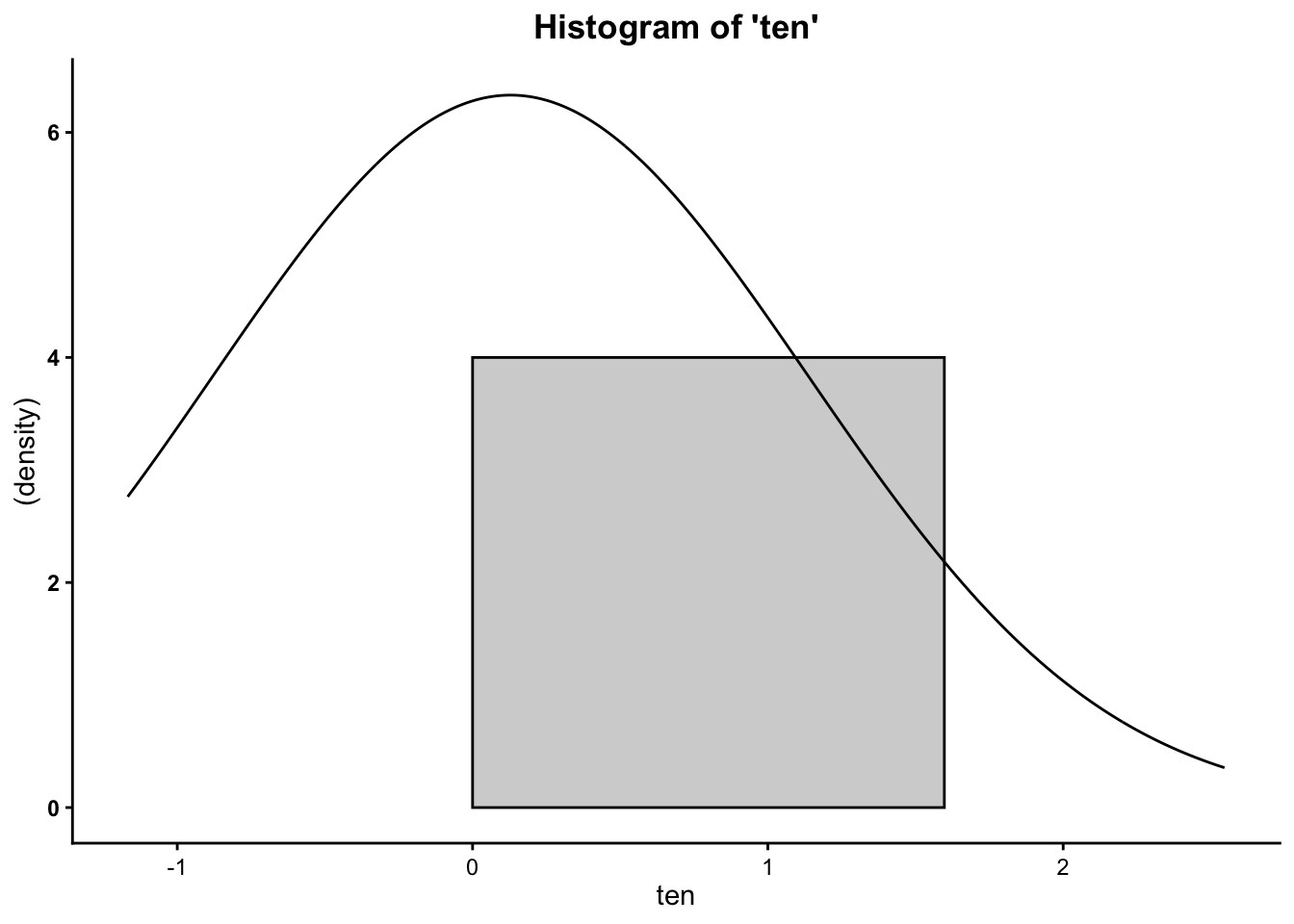
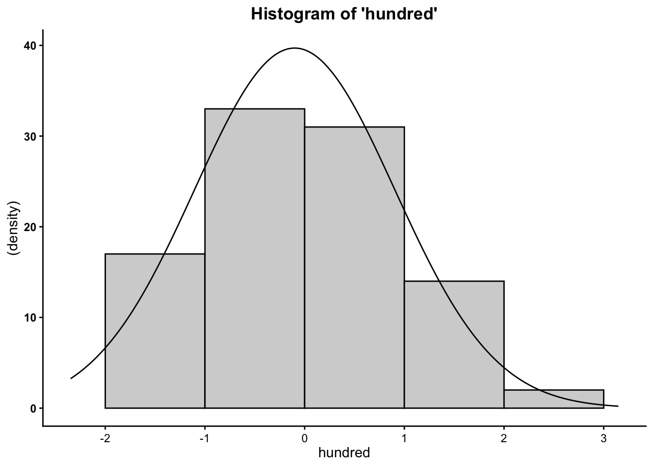
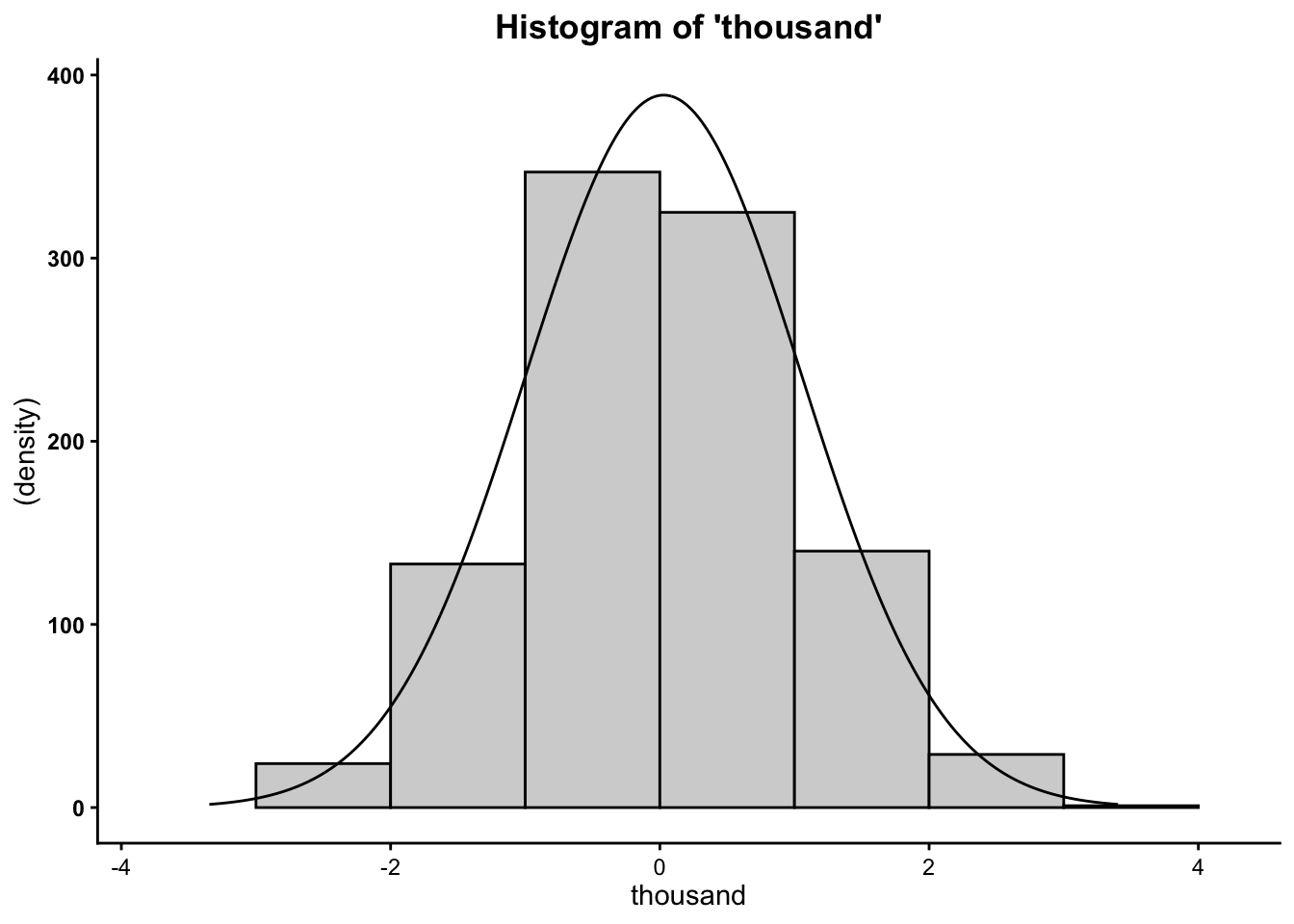
So now you know that the more cases/data points you have, the more your data will mimic the normal distribution (bell curve).